

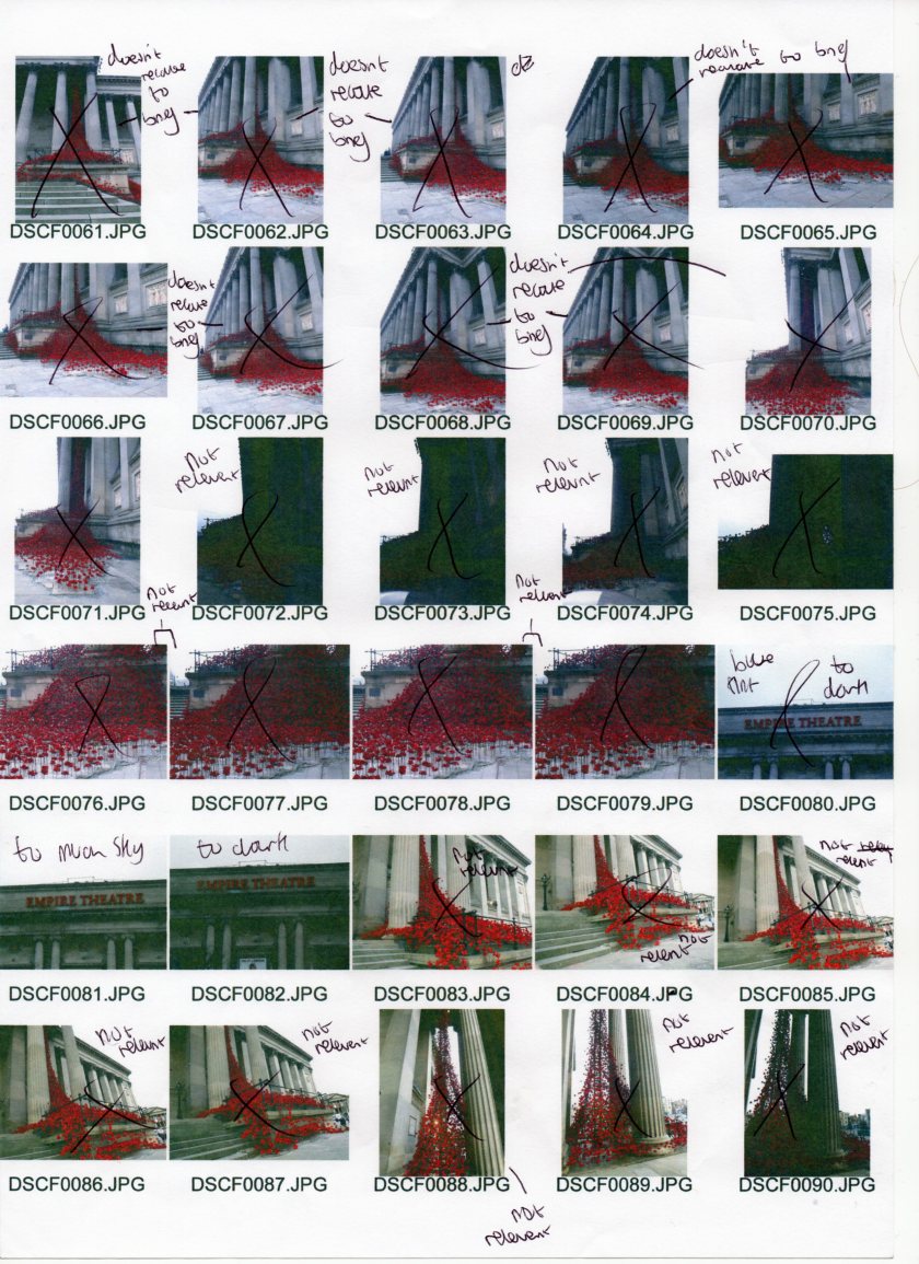


Above is my contact sheets for the images I have taken. I have annotated them which explain what I like and don’t like about the images. Doing these annotations has helped me sort out the good images from the bad images because I have taken 118 images that day so annotating them has helped streamline the good images. To help me go through the images I grouped them into locations and selected the best image from that location.

(unedited)

(Edited)

(edited black and white with noise)
an
Above is the 2 Liverbirds together. I wanted to capturer the Liverbirds because it is the most recognisable building in Liverpool. I also wanted to capture the Liverbirds because it is the symbol of Liverpool. when it came to editing I didn’t want to go overboard with the editing because I think when you over edit images it just kills the image. When I first looked at the image I felt the image was flat so in Photoshop I used the contrast adjustment. After I did that I felt the image needed brighting so in Photoshop I used the brightness adjustment. I saved that image and I wanted to play around with the black and white because the Liverbuilding is a historic building and I felt the black and white would compliment that fact. Looking at my David Hockney and polaroids research I noticed there was some grain in the images so using the noise filter in Photoshop I added the grain to give the image a film feel. Like Ansel Adams work I have attemped to capture the building in the correct light because when looking at Adams work I noticed the correct lighting makes the buildings “pop”. Compared to the first edited image to the black and white image I prefer the black and white image because of how the black and white complements the historic nature of the Liverbuilding. I think the black and white image cannot be used for a billboard because modern day billboards tend to be in colour not black and white. I think the colour edit would be suitable for a billboard because modern day billboards are in colour. I could use the lasso tool in Photoshop to copy and paste the 2 liverbirds into a new document in photoshop to start my billboard.The equipment I have used for this image is my Fujifilm Finepix SL260. Due to my camera being a bridge camera I had a fixed super zoom lens. When shooting this area I did use a tripod for some of the images but the above image was taken without a tripod. I also used a white balance card to get the correct colour for the image. I used a tripod for this image because I wanted to aim my camera up but that will make hands shake. The setting I had was: The shutter speed was 1/125 because the day was bright therefore I needed a fast shutter speed so the camera doesn’t take a lot of light in. The aperture was around f/12 because the day bright therefore I needed a large aperture so the image was over exposed. The ISO 400 which to me is high for a bright day but as the lighting was changing constantly I kept it the same so I didn’t have to kep changing it.

(unedited)

(edited)

(edited black and white)
I captured a single liverbird because I felt 2 liverbirds didn’t have any detail because I had to zoom out to capture 2 liverbirds. As you can see I have more detail now because I can zoom in more which can get more detail of the liverbird. I like the detail I can get because some modern billboards has a lot of detail. When I came to editing the image I didn’t want to over edit the image because I find over edited images kill the meaning of the image. I first used the contrast adjustment in Photoshop to give the image some “punch” because I felt the image was flat. I also used the brightness adjustment in Photoshop to make the image more brighter because I felt the image was dull. I saved the image and like the other liver building image I wanted to play around with the black and white and noise because I think the black and white would complement the historic aspect of the Liver building. In hindsight I felt I have gone over board with the noise because the image to me is over grainy. The reason why I added noise to the image because I wanted to recreate that grain to see how digital grain compared to natural grain. Comparing the first edited image to the black and white image I prefer the black and white image because compliments the historic aspect of the Liver building. I cannot see the black and white image as a billboard because there is to much grain. I also think the black and white image cannot be a billboard because most modern day billboards are colour. The colour I think could be used for a billboard because the image is in full colour and has more detail than the previous image of the liver building. The equipment I used was a Fujifilm Finepix SL260. Due to my camera being a bridge camera I had fixed super zoom lens. I also used a white balance card to help get the colour correct. I also used a tripod so I didn’t get camera shake because I was using a long zoom. The setting I used was: The shutter speed was 1/50 because the building was slightly backlit so I had to go with a slow shutter speed to get more light into the image. The aperture was f/16 which was a mistake on my part because I didn’t notice when I was shooting. I could of gone with a small aperture because the building was backlit therefore a small aperture would of brought some more light into the image. The ISO was 400 because the building was backlit so the high ISO brought light back into the image.

(unedited)

(edited)
I wanted to include the Radio City tower because Radio City is the most popular Liverpool based radio station. I also wanted to include the tower because as you see the Liverpool skyline this is one of the buildings you see. When I went to edit this image I corrected the colour because as you can see there is a blue tint to the image. I didn’t want that blue tint because the tint made the image feel “cold”. After I sorted out the blue tint I incressed the brightness because I felt the image was dull. I also increased the contrast because I wanted to give the image more of a “punch” and I just felt the image was flat. I didn’t add black and white to the image because I felt the black and white wouldn’t complement the building. The reason why I think the black and white wouldn’t complement the building is because the building doesn’t have the same amount of history as the Liver buildings. I can see this image being used in a billboard because the image is in full colour. Most modern billboards are in colour so the image would fit in. I can see this image being used in a billboard because of the detail in the image because most modern billboards has detail in the billboards.The setting I used for this image was: The shutter was 1/80 sec because the day was cloudy therefore I had to use an average shutter speed so the camera can take in the correct amount of light. The aperture was at f/12 because I had a average shutter speed therefore I felt I could have a large aperture. In hindsight I should of gone with a smaller aperture because a smaller aperture takes in more light and it was a cloudy day therefore a smaller aperture would of been best. The ISO was at 400 because the day was cloudy therefore a big ISO was needed so the camera can take more light in. The camera I used was a fujifilm finepix SL260. Due to my camera being a bridge camera I had a fixed super zoom lens. I also used a tripod to take this image because I had to aim the camera up so my arms were shaking. I didn’t use a white balance card but in hindsight I should of because the image has a blue tint which gives the image a cold feeling.

(unedited)

(edited)
I wanted to include Liverpool Central station because Liverpool Central station is one of the main local stations in Liverpool. When I went to edit the images I didn’t want to over edit the images because to me over editing kills the meaning of the image. I upped the brightness of the image because I felt the image was dull. I also increased the contrast via the contrast adjustment tab because I felt the image was flat and needed more of a “punch”. I didn’t try black and white because I felt it wouldn’t work well with the image because to me black and white doesn’t complement the image because Liverpool central doesn’t have the same amount of history as the Liver building has. I can see the image being used in a modern billboard because it is in colour and has some detail in the image. Modern day billboards are full colour and has detail so this image would fit. The settings I ended up using was: shutter speed was at 1/50 sec because it was a cloudy day therefore I had to use a slow shutter speed because a slow shutter speed allows the camera to take more light in. The aperture was f/12 because there was enough light for the aperture to be large. In hindsight I think I could of gone to a smaller aperture because it was a cloudy day. A smaller aperture allows the camera to take in more light. The ISO was 400 because it was a cloudy day so this allowed the camera to be more sensitive to light. I used my Fujifilm Finepix SL260 camera to take this image. Due to my camera being a bridge camera I have a fixed super zoom lens. I used a tripod to shoot the area but for this image I took the image without the tripod. In hindsight I wished I used a white balance card because there is a blue tint which gives the image a cold feeling.
 (Unedited)
(edited)
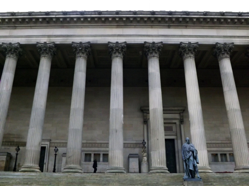
I wanted to include Saint Georges Hall because it is one of the most historic buildings Liverpool has. I didn’t want to over edit my image because to me over editing kills the mood of the image. I started by auto correcting the colour because I felt the image was out of colour. I then increased the brightness via the brightness adjustment because I felt the brightness was just off. I then adjusted the contrast via the contrast adjustment because I felt the image was flat. Despite the adjustments being basic I felt they were needed to make the image professional because I felt the original was not professional. The reason why I think this is because some of the mistakes were amateur mistakes. I didn’t add black and white because I felt the image would work best as colour. The reason why I think this is because the colour of the building clearly shows the history of the building. The camera I used to take this image was a Fujifilm Finepix SL260. I used a tripod to shoot the area but for this image I didn’t because the angle I wanted to get I couldn’t achieve via a tripod. The settings was: the shutter speed was 1/250 because it was a bright day and a fast shutter speed doesn’t take much light in. The aperture is f/3.6 because a small aperture allows more light in. In hindsight I could of gone with a larger aperture because the day was a bright day so I could of gone with a smaller aperture because a smaller aperture takes in less light. The ISO was 400. I could of made my ISO smaller because the higher the ISO the more the camera will be sensitive to light. The reason why I didn’t change my ISO was because the daylight was changing every second so I just kept it the same so I didn’t have to keep changing the ISO.

(unedited)

(edited)

(Redo)
The reason why I wanted to include Liverpool Lime Street station is because the station is the main station where people coming in from afar come to. The station is most recognisable station in Liverpool as well because of the glass dome. I will revisit the location because of the workers were in the way but I took the image anyway so I could get a feel for the location and what angles I could achieve. when I edited the image I didn’t want to over edit the image because I feel over editing the image would kill the image. I first corrected the colour because I felt the colour was of on the image. I then went on to increase the contrast via the contrast adjustment because I felt the image was flat. I went into the brightness adjustment to brighten the image because I felt the image was dull. The camera I used was a Fujifilm Fineppix SL260. Due to my camera being a bridge camera I have a fixed super zoom lens. I didn’t use a tripod for this shot as I didn’t zoom a lot. The settings I used was: the shutter speed was 1/750 because it was a bright day so I used a fast shutter speed to make sure there wasn’t a lot of light going into the camera. The aperture was f/3.4 but I should of gone with a larger aperture because a larger takes in less light and due to the day being a bright day the camera shouldn’t of taken much light because it could of over exposed the image. The ISO is around 400 but I could of gone of lower because it was a bright day therefore a lower ISO is needed because a lower ISO makes the camera less sensitive to light. The reason why I didn’t go lower was because the light was changing constantly so I kept it the same so I didn’t keep changing it every time.

(unedited)

(edited)
 (edited black and white)
I wanted to include The Anglican Cathedral because it is one of the most historic churches in Liverpool. To emphasis this fact I made a black and white edit of the image. The reason why I did this was to give the building more of an impact. I also added noise via Photoshop to the image to give it a polaroid look and feel to the image. The reason why I wanted to give the image a polaroid look and feel is because I think historic buildings work well with a polaroid look and feel. Before I added the black and white adjustment in Photoshop I used the brightness and contrast adjustment because I felt the image was dull and flat. The brightness and contrast adjustment helped remove the dullness and flatness of the image. I used my fujifilm Finepix SL260 bridge camera. Due to my camera being a bridge camera I had a fixed super zoom lens. The fixed super zoom lens helped too get the final detail of the image. I also used a white balance card to get my colour correct because an un-correct colour cast makes the image look awful. I didn’t use a tripod for this shot because I didn’t use a long zoom range. In hindsight I could of used a tripod to make sure the image was stable because my hands got shaky from aiming the camera up. The settings I used was: The shutter speed was 1/160 because the day was a bright day so I used a fast shutter speed to make sure the image wouldn’t of overexposed. The aperture I used was f/8 because it was a bright day so I needed a small aperture to make sure the image was overexpose. In hindsight I could of gone to f/10 to make sure the image wouldn’t overexpose. The ISO was 400 but in hindsight I could of gone lower because the lower the ISO the less sensitive the camera is to light and it was a bright day so I didn’t need a high ISO. As the light was changing constantly I just kept the ISO at 400 so I didn’t have to keep changing the ISO constantly.
